People
Pictures and pixels make statistics sexy
Updated: 2011-04-17 07:48
By Natasha Singer (New York Times)
|
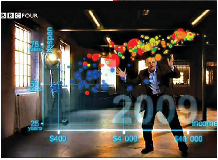
Gapminder uses data animation to show gaps in health and wealth. Dr. Hans Rosling, the group's founder. |
 |
|
In a graphic by Stamen, the size of |
In a world of boundless data, information designers are our new navigators.
They are computer scientists, statisticians, graphic designers, producers and cartographers who map entire oceans of data and turn them into innovative visual displays, like rich graphs and charts, that help companies and consumers cut through the clutter. These gurus of visual analytics are making interactive data synonymous with attractive data.
"Statistics," says Dr. Hans Rosling, a professor of international health at the Karolinska Institute in Sweden, "is now the sexiest subject around."
Dr. Rosling is a founder of Gapminder, a nonprofit group based in Stockholm that works to educate the public about disparities in health and wealth around the world - by offering animated interactive statistics online that help visitors spot trends on their own.
Hit the play button and an animated graphic, called Gapminder World, shows a constellation of colored bubbles, each representing a different country, bouncing along over two centuries. Without ever having to view yawn-inducing statistics, you can watch some countries, like Brazil, rapidly growing healthier and wealthier before your eyes while smaller bubbles, for countries like Congo, rise on the life expectancy axis even as they dip on the income line.
The animation makes statistics about poverty as intuitive and potentially fascinating as a nature program on TV. "If we show a herd of zebras, and one zebra has a bad leg and lags behind, you can see that immediately," says Dr. Rosling. "If one country gets left behind, you can see that, too."
Visual analytics play off the idea that the brain is more attracted to and more able to process dynamic images than long lists of numbers. The goal is to prompt visceral comprehension, moments of insight that make viewers want to learn more.
"The purpose," says Ben Shneiderman, founding director of the Human-Computer Interaction Laboratory at the University of Maryland, "is insight, not pictures."
 |
The growing field has implications for companies, governments, academic institutions, nonprofit groups, news organizations and marketers. But advances, he says, come with both benefits and risks.
People become more engaged when they can filter information that is presented visually and make discoveries on their own.
But, Professor Shneiderman says, tools as powerful as visualizations have the potential to mislead or confuse consumers. And privacy implications arise, he says, as increasing amounts of personal data become widely accessible.
In the 1990s, Professor Shneiderman developed tree mapping, which uses interlocking rectangles to represent complicated data sets. The rectangles are sized and colored to convey different kinds of information, like revenue or geographic region, says Jim Bartoo, the chief executive of the Hive Group, a software company that uses tree mapping to help companies and government agencies monitor operational data.
"It's the ability of the human brain to pick out size and color" that makes tree mapping so intuitive, he says. Information visualization, he adds, "suddenly starts answering questions that you didn't know you had."
The Hive Group has also posted a tree map of the 100 most popular songs on iTunes, updated every 24 hours.
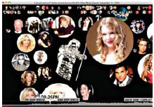
In 2009, Stamen Design, a technology and design studio in San Francisco, created a live visualization of Twitter traffic during the MTV Video Music Awards. In the animated graphic, floating bubbles, each displaying a photo of a celebrity, expanded or contracted depending on the volume of Twitter activity about each star, allowing viewers to understand which celebrities dominated Twitter talk in real time, says Eric Rodenbeck, the founder of Stamen Design.
Designers, Mr. Rodenbeck says, once steered viewers to information that seemed the most important or newsworthy; now, they create visualizations with attractive overview images and then let users direct their own interactive experience.
The company's mondowindow.com shows airline passengers with Wi-Fi access a detailed satellite map of the landscape they are flying over - and lets them direct the view.
Information bubbles highlight place names, local landmarks and tourist attractions, and photos of native fauna.
"It's not about leading with a certain view anymore," says Mr. Rodenbeck. "It's about delivering the view that gets the most participation and engagement."
The New York Times
E-paper

Blowing in the wind
High-Flyers from around the world recently traveled to home of the kite for a very special event.
Image maker
Changing fortunes
Two motherlands
European Edition
Specials

Models gear up car sales
Beauty helps steer buyers as market accelerates.

Urban breathing space
City park at heart of Changchun positions itself as top tourism attraction

On a roll
Auto hub Changchun also sets its sight on taking lead in railway sector